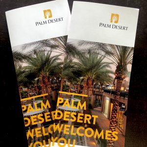
Let’s Get Your Brochure Started
 As a long-standing promotional staple in the business world, brochures have been used to market large amounts of information about products and services in a convenient and organized manner. Brochures are versatile enough to be used in just about any industry and have proven time and time again as a powerful and effective tool for engaging audiences. Whether you need a trade show handout, informational pamphlet, or takeout menu, it all comes down to the design. Good design equals good results, but a bad design ends up in the garbage, producing zero results. Read these 5 design tips for effective brochures to help get you started.
1. Layout
Plan out the brochure layout before you begin to design, keeping your target audience in mind. How would your ideal customer want to receive information? Keep your copywriting concise and break up big blocks of text with bullet points and images. Colors and fonts should be consistent with your brand and mirror what you use on other marketing materials such as your business cards and website.
Before you start, take some time to consider the basic components of any brochure:
- Color scheme – If you already have a brand ID and color palette that you use, you obviously want to stick with those. Otherwise, find a color scheme that will best complement your business.
- Fonts – Stick to 2 or 3 classic and versatile fonts like Helvetica or Georgia that are simple and easy to read.
- Content – Write out all the text for each panel on a separate document so you can copy and paste as needed. Try to keep it at a minimum.
- Images – Your images are the first things people see. Make sure you have high-resolution versions of all the photos and graphics you plan to use.
2. Grab their attention
When potential clients or customers are perusing brochure display racks, you want to quickly grab their interest and make it easy to find something that appeals to them. Keep the cover simple, with the text limited to the bare minimum needed to convey the brochure’s subject matter.

Take advantage of headlines and sub-headers to structure your copy and make it easy to skim for those who read on the move and don’t have time to read through the whole thing.
Each panel should have a clear header such as “how to order” or “contact us.”
3. Keep it simple
One of the more common mistakes we see is business owners wanting to use every inch of space on their promotional materials. There’s no need to overwhelm your reader by overcrowding your brochure design with too much text, too many graphics, or random design elements that compete for the reader’s attention. Don’t be afraid of white space – when used correctly, it adds emphasis to your text and keeps the design clean, simple, and easy to retain.
A good rule to follow when designing your brochure, stick to no more than 4 colors and no more than 3 fonts.
4. It’s all in the fold
Without a fold, all you have is a flyer. The folds are what separate a brochure from other types of print marketing materials. Select a brochure type based the content you have. For example, restaurant owners often use a larger half-fold menu for their dine-in customers but throw in a compact tri-fold menu to place in delivery and take-out orders.
Popular folds include:
- Tri-Fold – The most popular fold for brochures is a classic Tri-fold.
- Z-Fold – Used mostly when presenting different services or products on separate panels. This
 is also a feature that nonprofits can use to display various donor levels.
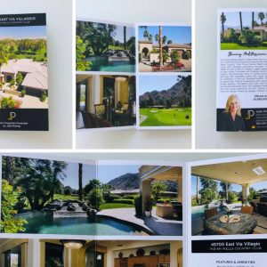
 - Accordion – Similar layout to a Z-Fold brochure but with an additional panel. Perfect for companies looking to recruit new employers or investors – use one side to present a timeline of significant events and milestone dates.
- Half Fold then Tri-Fold – Use this 12-panel brochure for more comprehensive topics or subjects. These are especially popular with amusement parks and other venues, as they can unfold to reveal a large map.
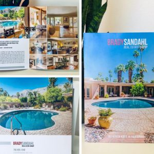
- Open Gate Fold – Real estate agents love using this fold to showcase their listings – feature a gorgeous exterior shot on the cover and stunning interior images on the inside.
- Closed Gate Fold – This fold is similar to an open gate brochure but with an additional final vertical fold. Perfect for retail store grand opening invitations or even personal birthday party invitations!
5. Choosing the right paper stock and finish
At Xpress, we will work with you to select the best materials for your brochure, going beyond the 5 design tips for effective brochures.
Once we have selected a good stock that will stand out against competitors’ brochures, it’s time to pick a finish.
- Glossy – Generally speaking, customers choose to print their brochures on high-quality gloss cover stocks. After all, a glossy finish is known for having a beautiful sheen that helps protect your product and makes colors appear rich and vibrant.
- Matte – If your brand vibe is vintage-inspired and soft, then a matte paper stock may better reflect your company’s image.
Keep in mind, if you are printing brochures with questionnaires, surveys, or other interactive material, uncoated paper stock is the ideal choice due to its writable surface.
For further assistance or a quote on designing and printing an incredible brochure, stop by our print shop in Palm Desert, or call us at 760-345-2741. One of our friendly sales professionals will be happy to assist you with guidance and a print quote.


