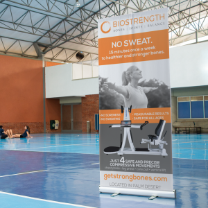
 Reach a Greater Audience with Quick and Easy Mobility
During a trade show, conference or even for and in-store event, time is money and you need to stand out. Retractable Banners are a subtle way to get your message across via high visibility. These bright and attention-grabbing banners come with a multitude of benefits. As long as your layout and designs are relevant and appealing, they can easily catch a newcomer’s eye.
Xpress Graphics can help in creating or printing a well-designed retractable banner to aid in foot traffic for your business, church, charity, institution, or event. Read on for our pointers on how to create a powerful message and imagery so your banner reaches a greater audience with their quick and easy mobility.
When Messaging Matters Most
The most effective messages are always the simplest. Your message should be a clear and brief expression of one idea. Retractable banners offer a lot of room for copy and imagery, but you don’t want to overwhelm the consumer passing by. Overloading your banner with paragraphs of data and details will distract from the actual purpose of your retractable banner, which is to draw people in and increase foot traffic.
The Breakdown on Messaging:
- Simple Layout – A good rule of thumb is LESS IS MORE
- Keep it Short– Use short simple words with quick and easy comprehension. Limit or eliminate punctuation and edit down to the bare bones of your message.
- 6 Second Rule– Does your message communicate effectively within 5-10 seconds? The average consumer will only spend 6 seconds to view advertising.
- Call to Action– Is the call to action clearly found on the banner? Does your target audience have the necessary information to respond to your ad?
- Balanced Logo – There has to be balance between the image and the logo. The logo is typically not as big as the image. About 1/8 of the banner size is a pretty good guideline for the smallest the logo should be.
Meaningful Images
Vibrant images will radiate to eyes from afar, so choose images that are mesmerizing and attractive. The colors and image should also be emotionally driven. Content Strategists at Contently state that emotions have profound impact on our actions and create lasting, instinctual impressions. The best emotional advertising will reach a resolution, in this case it is to leave a lasting emotional presence with the consumer.
You should also be mindful of choosing images and colors that suit the context of your banners. They should also appropriately contrast the text so that it doesn’t drown in the photos and take away from the messaging.
The Breakdown on Imagery:
- Contrasting Colors– High color contrast is the key to good readability. Colors that work best: black, white and bold, primary colors like red, yellow and blue. Black text on yellow rates the highest in readability. Colors to avoid: brown, earth tones, pastels.
- Single Image– Use one large image to attract the reader’s eye to the retractable banner. For example, a single image of a person works better than having a group of people. Take a small object and make it large (like jewelry) rather than making a large object small (like a house).
- Simple Background– Use a simple background that does not interfere with your image, copy or logo. Too much blank space isn’t a good thing either. Use the blank space and make your fonts, image and logo bigger.
If you would like a quote for your own retractable banner, stop in or contact one of our friendly sales professionals for our competitive rates that don’t compromise quality.


